2020
about project
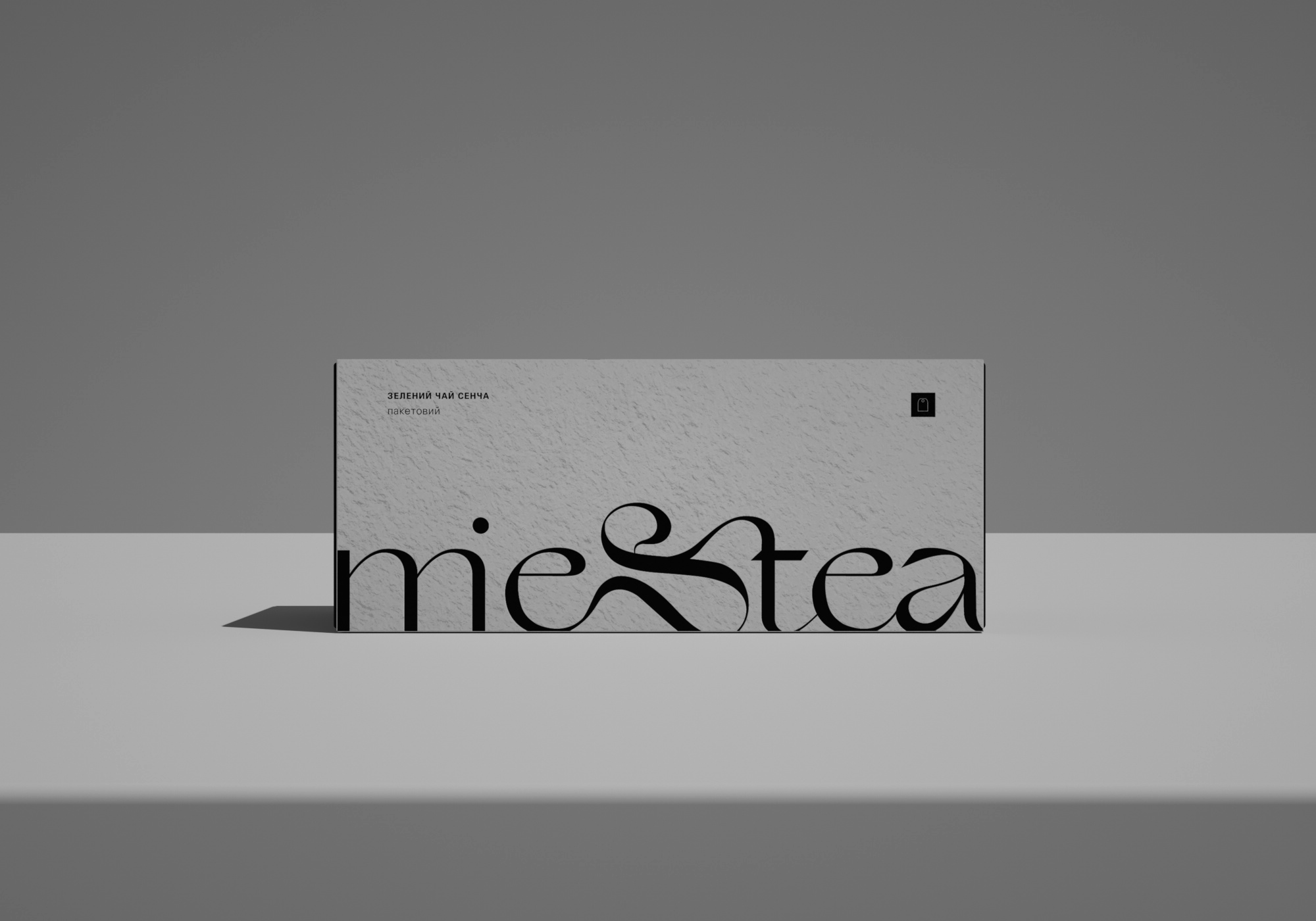
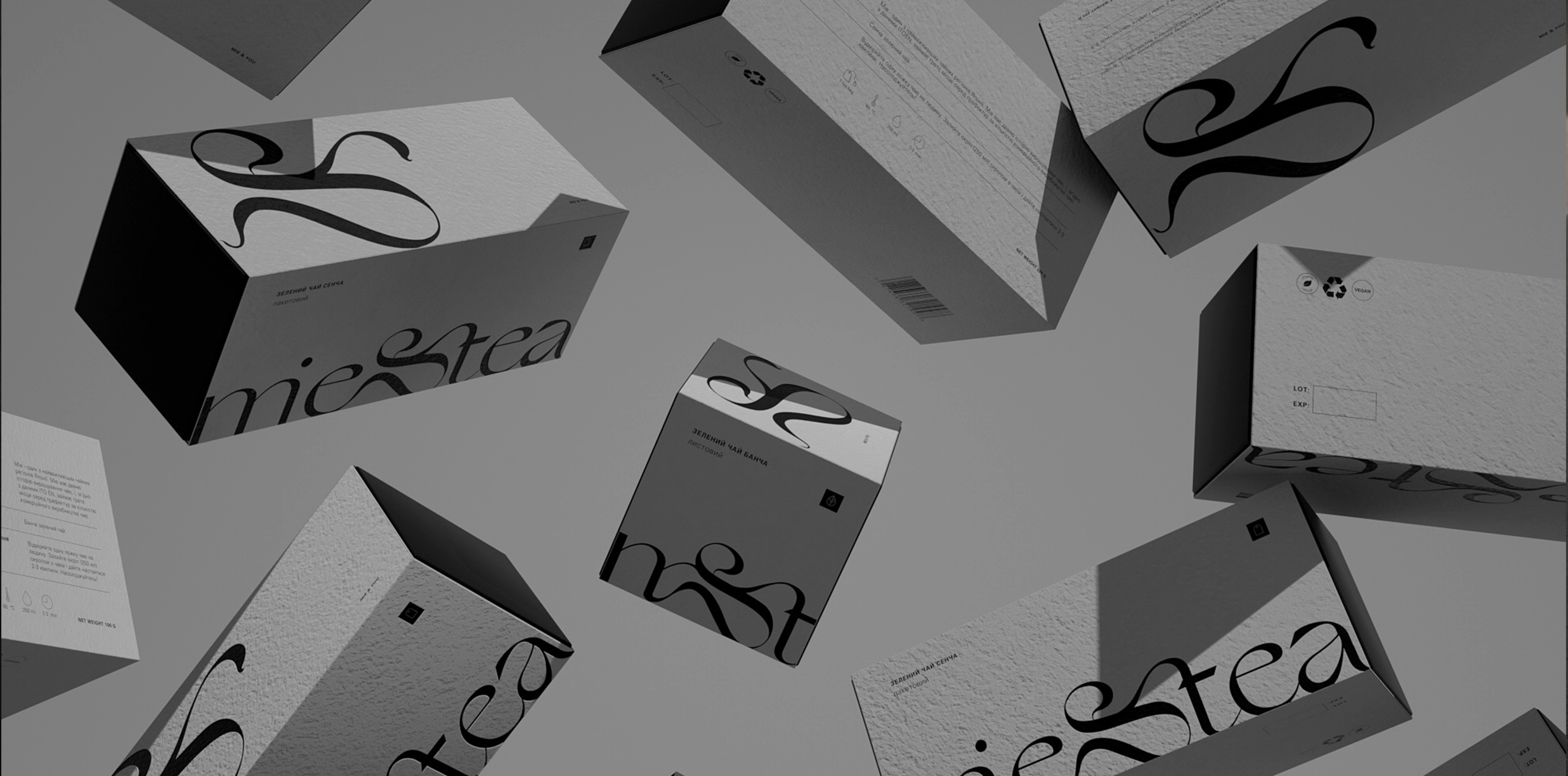
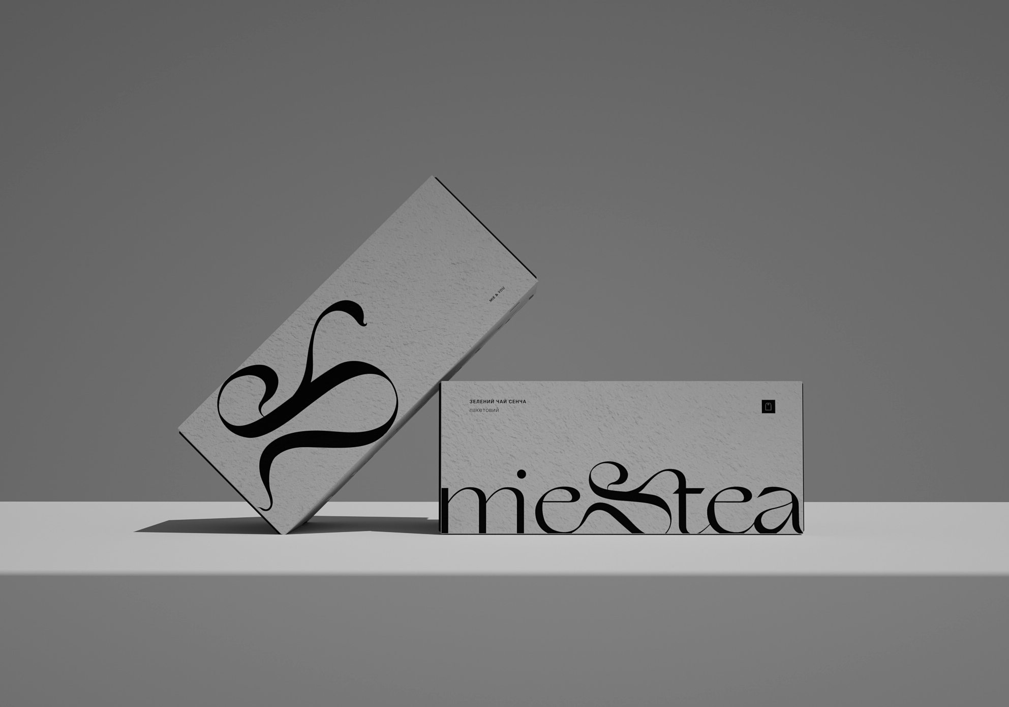
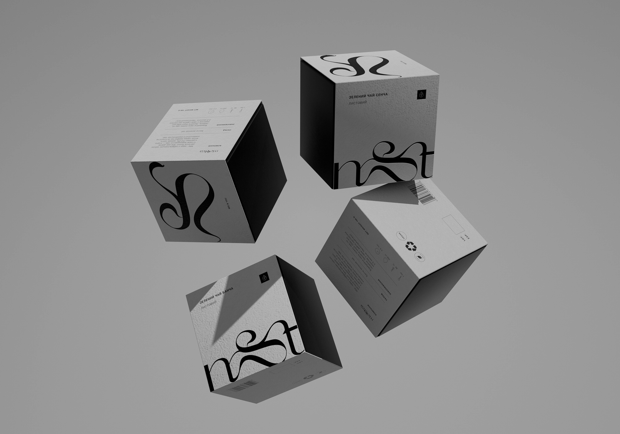
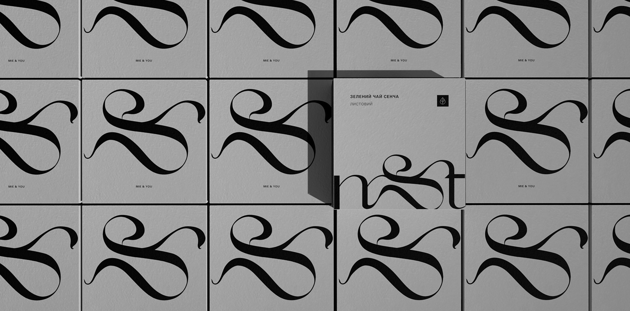
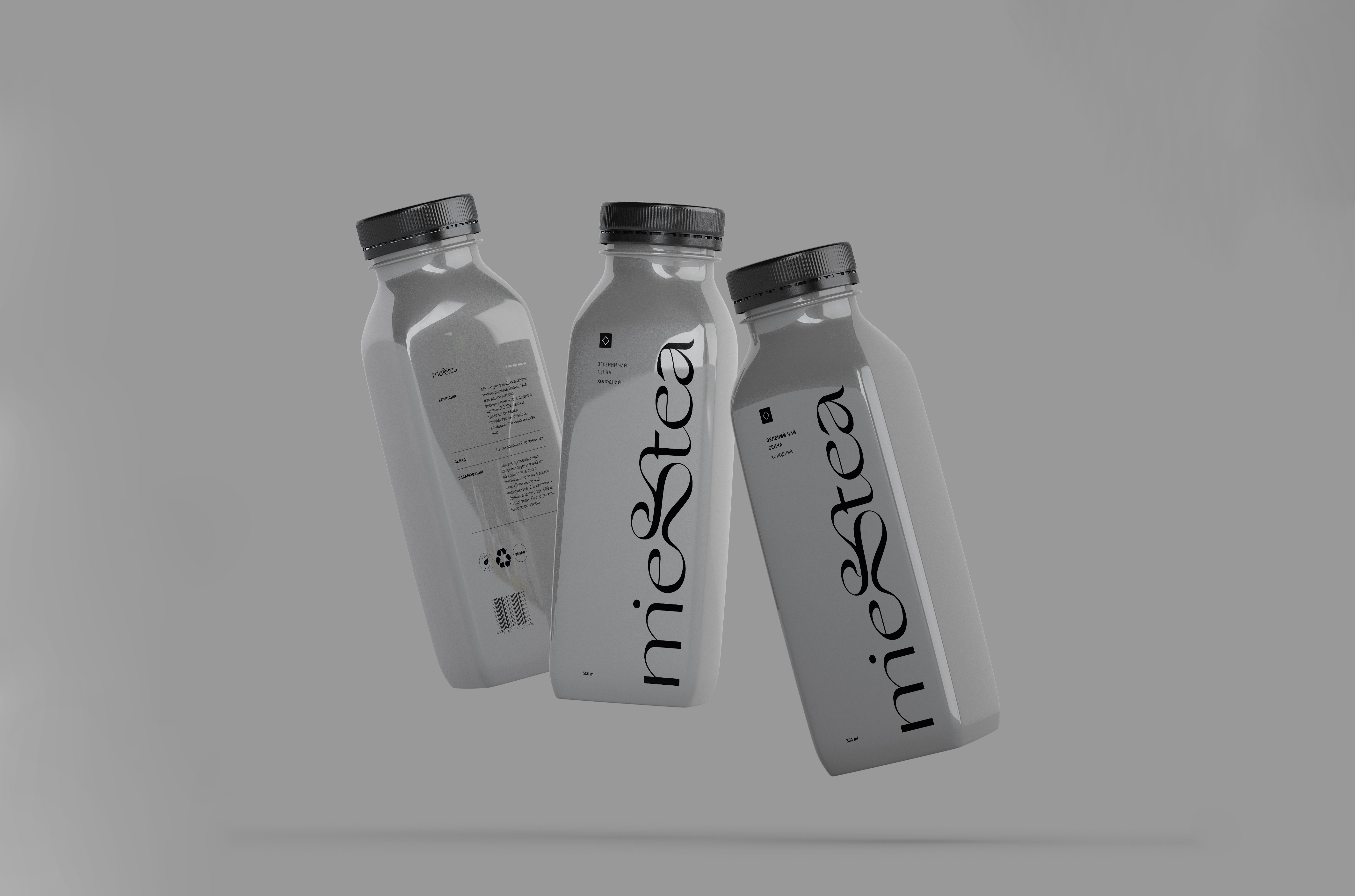
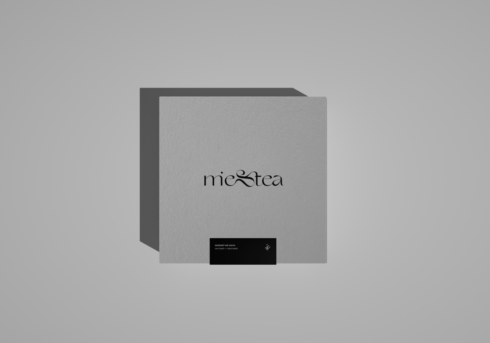
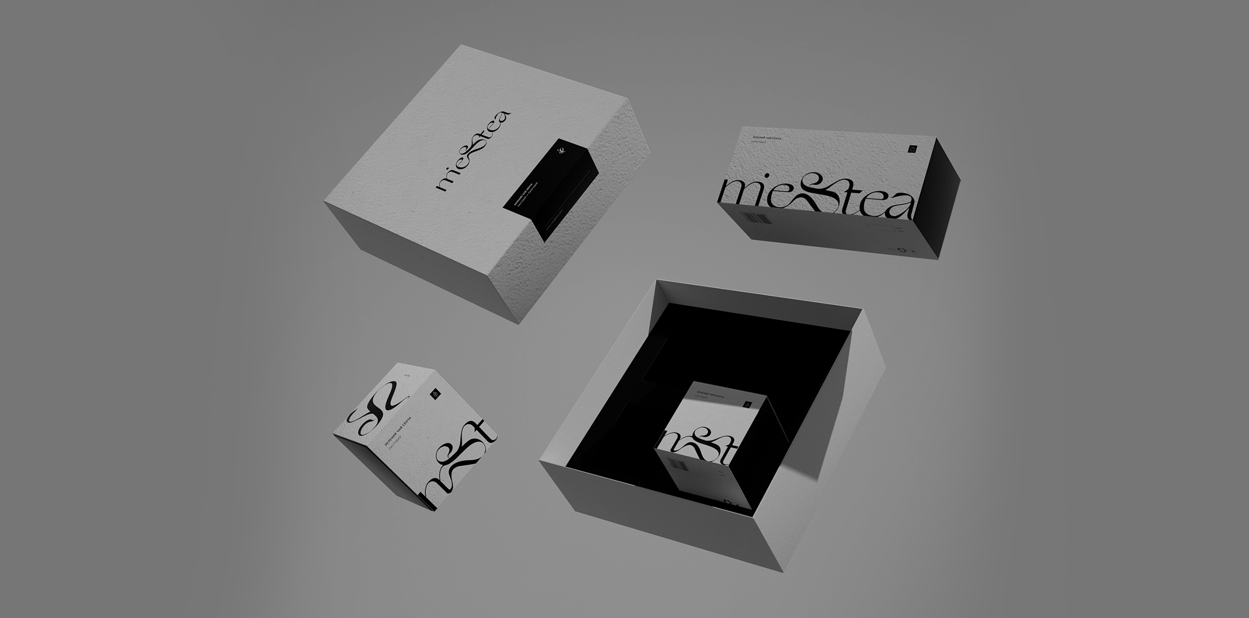
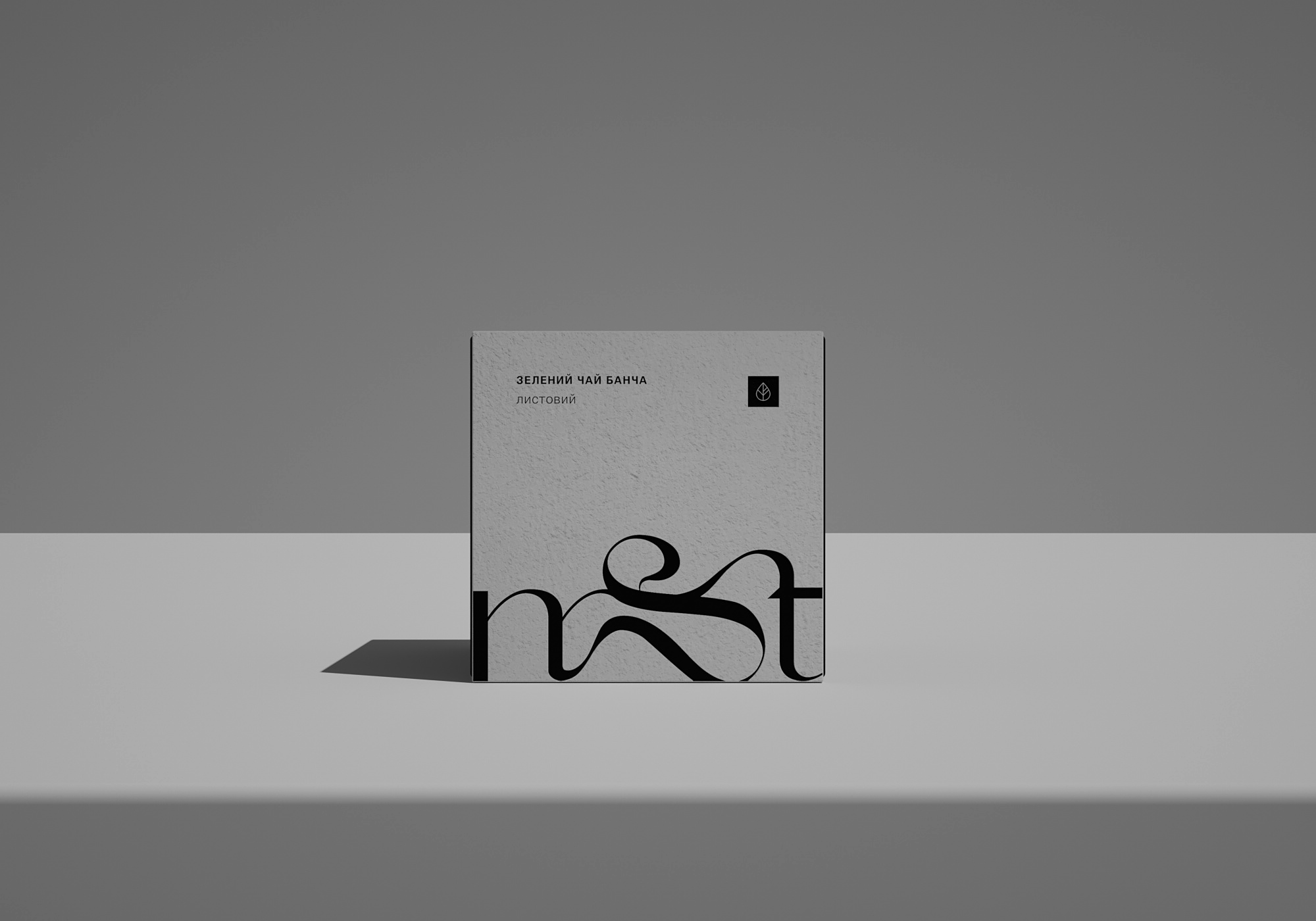
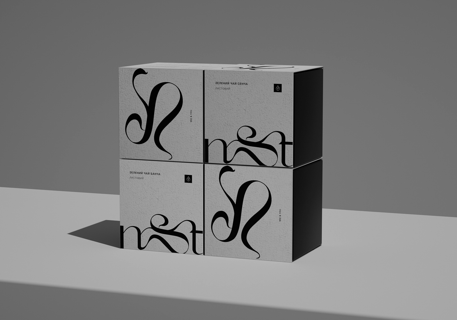
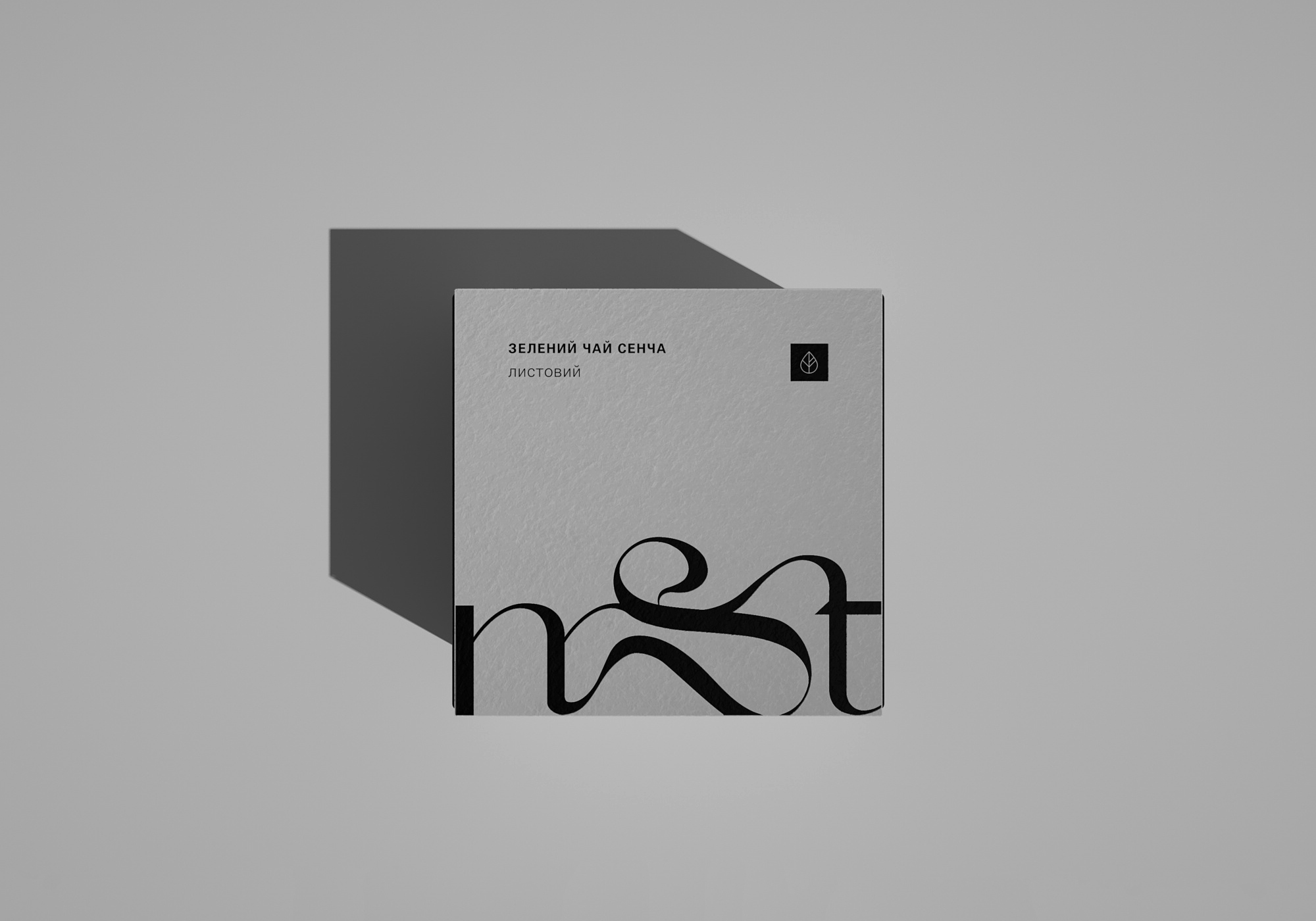
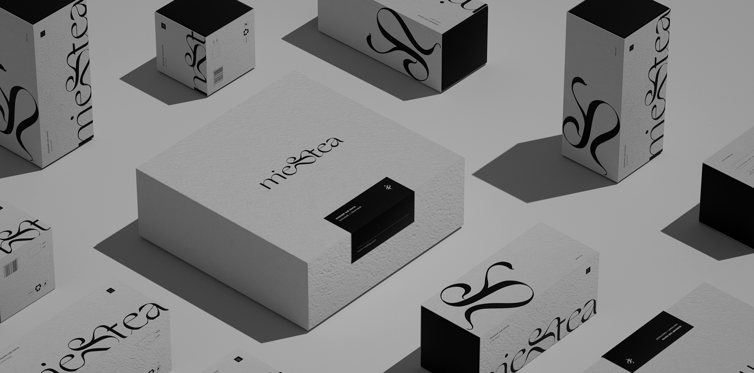
"Mie" prefecture is the third largest tea producer in Japan. The tea region is called Isecha and produces mainly Sencha tea. I set out to create a minimalist, Japan-inspired tea brand with a symbolic logomark and restrained color palette. Unique logo and grey cardboard set the tone for the packaging. The logomark - a combination of the words "mie & tie" - and a simple packaging form emphasizes the spirit of the brand. I had used the 3d visualisation tool for the best material and style representation.